Update summary
A unified business platform for managing everything from client projects to internal processes in one affordable, award-winning solution.
We’re happy to announce that you can now connect Flowlu with hundreds of other apps by using Integrately. It is super easy and no coding skills required. Currently, there are 4 triggers available for Flowlu: task, CRM account, project or opportunity creation. You can select an integration from the list of ready automations or build your own.
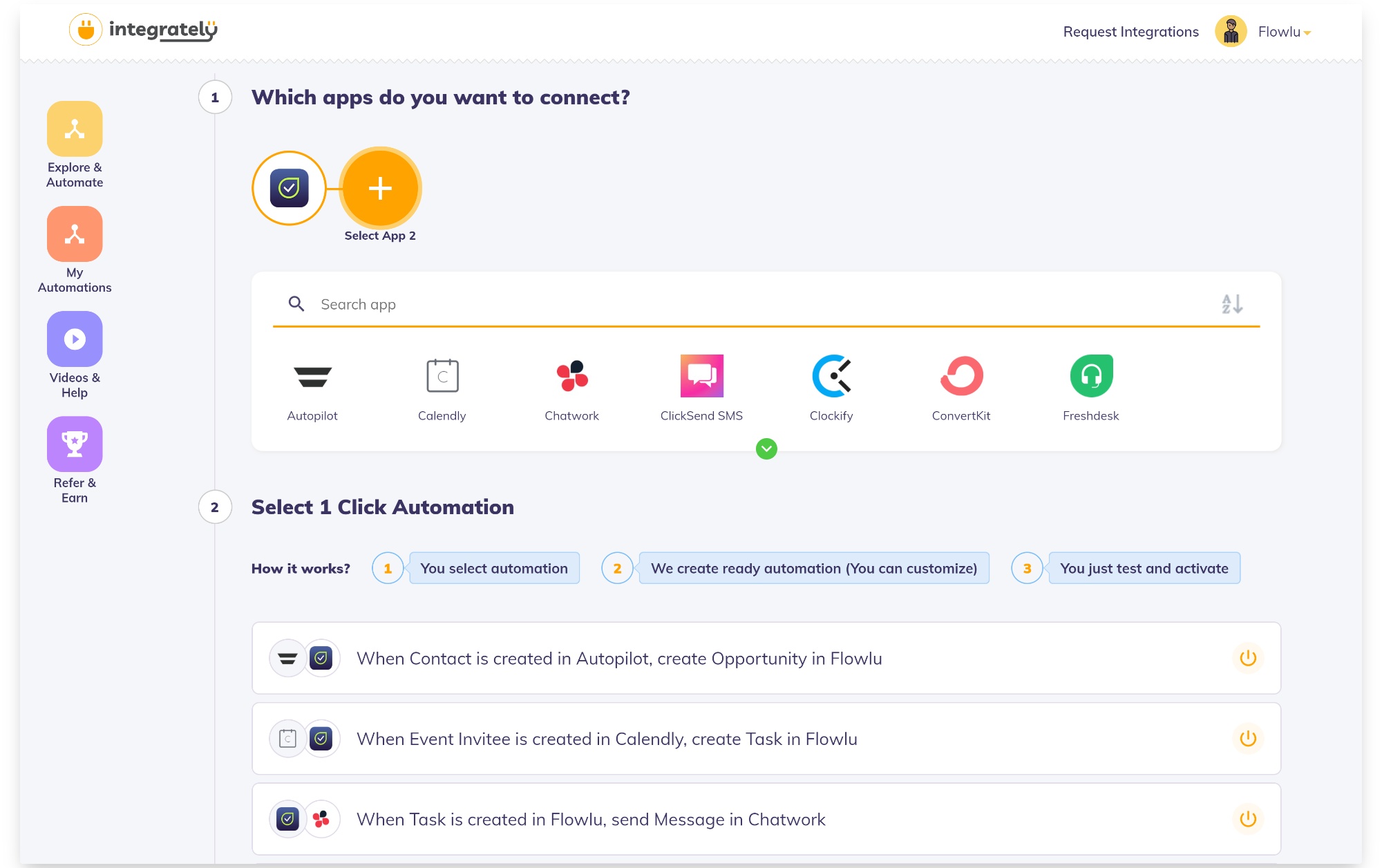
… and so much more!
Besides, Integrately allows you to create multi-step workflows and connect up to 6 tools.
The best part is that they have a free trial, so you can test it out even today and integrate up to 733 tools 🤯 with Flowlu. Cheers!
Each Flowlu portal has its unique subdomain, e.g. yourcompany.flowlu.com. From now on, instead of pointing your users to the default Flowlu URL, you can use a custom domain. For instance, you can map company.flowlu.com to company.com or portal.company.com. Once you create a custom domain in Flowlu, the free SSL-certificate will be generated and enabled automatically for your domain.
How to configure a custom domain
Custom domain is available at Enterprise subscription plan only.
The Kanban boards across all modules have been refreshed and got an improved UI. They’re now more modern, clean and easier to use. Each task card now includes the name of a specific project or opportunity. This allows you to quickly navigate to the detailed information. Additionally, the card also indicates the number of comments for each task.
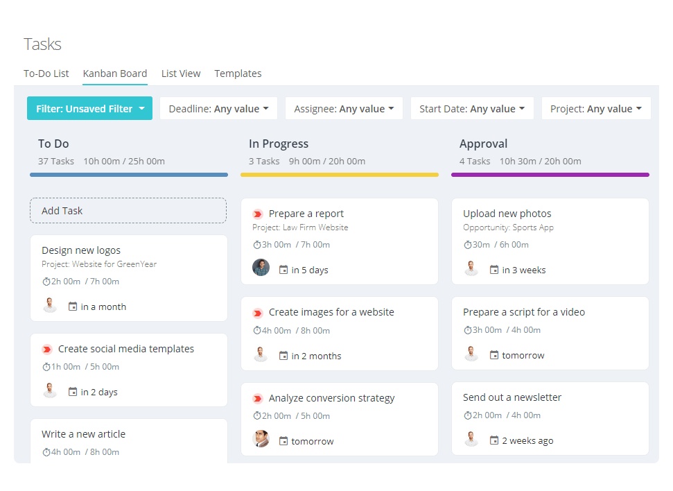
It's time we share some recent, notable product updates! Today they’re with a special emphasis on improving the usability and capabilities of the Tasks module. Now you can view your assignments right from the Tasks module in multiple ways — GTD to-do list, kanban board, list.
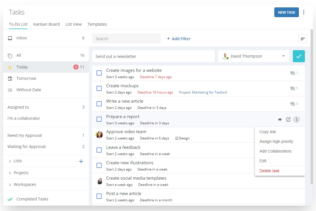
The to-do list section helps you to focus on what's important at a given time. We've cleaned it up a bit and left only the most relevant folders to simplify the management of your current tasks.
We've also improved the way you can handle your tasks right from the to-do list. From now on, you can:
Kanban Board gives you a clear overview of all your current tasks and their states. By the way, if you're the Tasks module admin, you can see the tasks of the entire team there. The board makes it easy to view deadlines, priorities, and overall work progress. If you use multiple custom workflows for tasks, you can instantly switch between them and get an clear visual representation of your work.
The Task List allows you to customize columns. We also recommend using this section to bulk edit and delete tasks.
The Templates section brings together all task templates including the templates for recurring tasks. Use the button in the top right corner to switch between your own and your team’s templates.
Filters are now available in all sections of the Tasks module to easily search for tasks by the specified parameters. We have added filters by projects, collaborators, workspaces. Now it will be simpler for you to manage the tasks you are involved in.
Other improvements
Hey, we’re super excited to be featured on Product Hunt for the first time. Please support us today and leave your feedback by following this link.

From now on, you can automatically add a comment or publish a post to the activity feed of each task or an opportunity. With the these new automation actions, you can automatically publish messages specific for your business. For example, you can post a notification if the deadline is missed but the task is still at the “Doing” stage. Or, you can automatically add certain reminders or tips for the assignee.
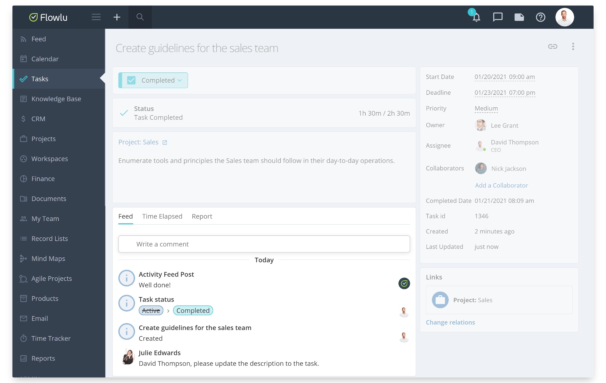
You can now add your own custom fields to the issues of the agile projects. For instance, you can show the relation to the contact, record list or add any other information that meets your team’s requirements.
Task management tools let teams keep track of tasks with less effort, stay organized, eliminate miscommunication and skyrocket productivity. Explore our latest guide to learn 8 simple steps to improve your results with Flowlu by using it for task management.